Why Your Color Palette Has a ZIP Code: A Road Trip Through America's Regional Illustration Styles
Every illustrator has a origin story, and most of them start with weather.
Think about it. Before the art school, before the first tablet, before the crushing student loan realization — there was a kid somewhere looking out a window at a very specific sky. Gray and brooding? Blazing and humid? Crisp and judgmental? That sky got into the paint, and it never fully left.
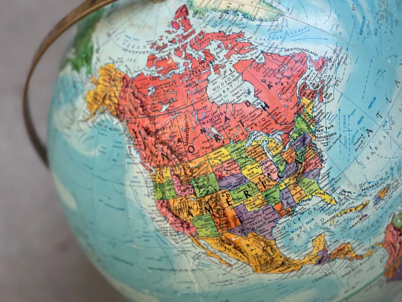
We took a road trip — the imaginary, metaphorical kind, fueled by cold brew and portfolio tabs — across America's regional illustration styles, and what we found is that whimsy has an accent. A thick one.
The Pacific Northwest: Moody, Woodsy, and Emotionally Available
Start in the Pacific Northwest, where the light filters through Douglas firs at a permanent golden hour that lasts approximately four minutes a day. It should surprise no one that PNW illustration leans atmospheric — deep teal shadows, misty gradients, characters who look like they have a complicated relationship with their fathers and a cozy cabin to process it in.
There's a reason the Pacific Northwest practically minted the modern "cozy melancholy" aesthetic. When your sky is overcast 220 days a year, you don't fight the gray. You commission it. The result is work that feels like a warm sweater with a slightly haunted lining — and audiences across the country can't get enough of it.
The South: Saturation as a Survival Strategy
Drive down to the American South and the palette detonates. Kudzu greens. Peach pinks. Church-dress purples. Humidity so thick it should be billed as a co-author.
Southern illustration tilts hard toward saturated storytelling — tall tales, gospel energy, front-porch narrative compositions where every character is mid-sentence and every color is mid-shout. There's a long tradition here of illustration as oral history with the volume turned up. Where the Northwest whispers, the South testifies. A Southern-drawn character rarely just stands there; they're about to tell you something, and it's going to take a while, and you're going to love it.
New England: Ink, Wit, and a Raised Eyebrow
Then there's New England, birthplace of the editorial cartoon and the world's densest concentration of raised eyebrows. The regional style here runs toward ink-and-wit: crisp linework, limited palettes, visual jokes that require a small bibliography to fully appreciate.
It makes sense. This is a region that invented both the town meeting and the sarcastic reply. New England illustration doesn't seduce you with color; it out-argues you with line weight. The characters are droll, the negative space is deliberate, and somewhere in every composition there's a joke you'll catch on the second look — because New England doesn't explain itself on the first date.
The Midwest: Nice Colors, Serious Feelings
The Midwest deserves its own paragraph, if only because its illustrators would never ask for one. Regional work here leans earnest — flat, friendly palettes, generous round shapes, characters who would absolutely help you jump your car. There's a quiet surrealism hiding in the Heartland too, all that big sky and flat farmland breeding a particular brand of lonely-but-lovely whimsy. Think wide horizons, tiny figures, and a color palette that says "everything is fine" while the composition quietly wonders if it is.
So Does 'American Illustration' Even Exist?
Here's the thing our road trip kept revealing: the further you zoom out, the more the regions blur. A Brooklyn art director commissions a Portland illustrator to draw a Atlanta story, and the result lives on a Los Angeles magazine's site. Migration, the internet, and one very chaotic decade of remote work have scrambled the maps.
But the accents persist. Because geography doesn't just shape what you see — it shapes what you notice, and what you notice becomes your style. The fog, the humidity, the autumn light, the endless corn: it all becomes a default setting in the back of your creative brain, quietly adjusting your hues while you swear you're making purely rational color choices.
You aren't. Nobody is. Your ZIP code has been ghostwriting your palette this whole time.
A Field Exercise for the Curious
Want to test this? Pull up your three favorite pieces of your own work and check them against your hometown sky. Then check them against the sky where you live now. Somewhere in that gap — between the light you grew up with and the light you pay rent under — is your actual style, arguing with itself in color.
The founding fathers never had brushes worth fighting over, despite what the gift shops say. But their landscapes? Those are still in the paint. Every regional style in America is just a long conversation with a very specific patch of sky — and the best illustrators are the ones who learned to answer back.