In Praise of the Lopsided: Why the Best-Loved Characters Have a Face Only a Portfolio Could Hate
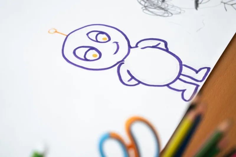
Let's say it plainly: nobody has ever formed an emotional attachment to a perfectly symmetrical face.
You can test this at home. Set a glossy, idealized character design next to something like Quasimodo, Shrek, or the bedraggled heroine of any given Mo Willems book and ask a five-year-old which one they want to hug. It's not close. The bump on the nose wins every time.
And yet the pressure toward prettiness in illustration is real and constant. Portfolios full of luminous, symmetrical faces flood every art director's inbox. They're competent. They're pleasant. They vanish from memory approximately four seconds after scrolling past.
The Physiology of Charm
There's a reason the misfits stick. Human brains are wired to read faces for story — a crooked smile implies a history, a heavy brow implies a mood, a posture that suggests the character lost a fight with gravity implies an entire personality. Symmetry communicates nothing except that a drawing tool had a mirror function.
Great character designers understand this instinctively. The great Maurice Sendak didn't draw adorable children; he drew small, stubborn, slightly feral-looking people with cowlicks and attitude, and generations of kids recognized themselves instantly. Tony DiTerlizzi built a career on creatures that look like they've been living under your porch, and readers loved him for it.
The formula, such as it is: flaws are features. A wart is a hook for the eye. Bad hair is a mood. A character with an underbite has already told you something about how they eat, argue, and greet the world.
Art Directors Are Over the Gloss
Something has shifted in editorial and publishing circles over the past decade. Ask art directors what they're hungry for and the answers keep circling the same theme: texture, personality, hand-made mess.
Part of this is a backlash against the airbrushed sameness of algorithm-friendly art — the big-eyed, small-nosed, endlessly repeated face that dominates feeds. When everyone can generate pleasant, art directors start paying a premium for specific. A character with a unibrow and a hunched shoulder reads as authored by a human with opinions.
Part of it is also emotional honesty. Editorial illustration, especially in American magazines and newspapers, needs to communicate complicated feelings fast. A pretty face is neutral; a lopsided, weary, wart-nosed face is already halfway to the joke, the grief, or the critique before a single word of the headline is read.
How to Draw Ugly on Purpose
For illustrators hoping to lean in, the moves are surprisingly concrete:
- Break symmetry first. Shift the eyes, shrink one ear, let the jaw wander. One asymmetry per feature is usually enough.
- Give the body an opinion. Slouching, leaning, tiptoeing — posture is personality made visible.
- Add one feature too many. A mole, a snaggletooth, a cowlick that defies physics. The specific weirdness is the signature.
- Resist the prettiness pass. Most character designs get sanded down in the final stages. Stop sanding.
The goal was never to make characters people admire. It's to make characters people recognize — the ones readers describe to their friends, name their pets after, and demand sequels for.
The pretty ones get likes. The lopsided ones get loved. Choose accordingly.