Saturday Morning in a Paint Tube: Decoding the Palettes That Raised Us
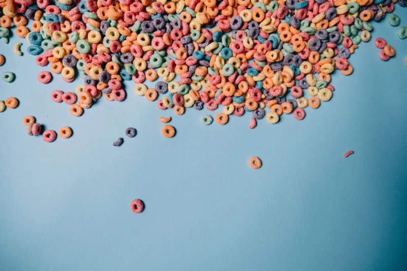
Close your eyes and picture a Saturday morning from your childhood. I'd bet money I know what colors are in there: a sunnied-up yellow, a sky that's slightly too blue to be real, and a red that exists nowhere in nature but absolutely existed on your cereal box.
Nostalgia has a palette. Actually, it has several — and as someone who draws whimsical characters for a living, I've spent an embarrassing amount of time reverse-engineering them. Here are the five big ones, why they work, and how to swipe them like a professional.
1. The Cereal Aisle: Saturated Primaries on Cream
Formula: tomato red + golden yellow + cobalt blue, on a warm off-white.
This is the palette of the grocery store of your youth. Those primaries were engineered to scream from a shelf at a six-year-old from fifteen feet away, and they never stopped screaming — they just followed us into adulthood. The warm cream background is the secret; it softens the primaries just enough that they read as cheerful instead of alarming.
Modern use: great for editorial pieces about consumerism, childhood, food, or anything that wants a wink of American optimism.
2. The Picture Book Wash: Muted Crayon Tones
Formula: dusty teal + brick red + mustard + pencil-gray, all slightly desaturated.
Every library picture book from the 80s and 90s lives here. These palettes feel hand-touched because they often were — think of that slightly chalky, crayon-box-but-faded quality. The desaturation is doing emotional work: it says cozy, safe, someone is reading this to you.
Modern use: perfect for personal essays, nostalgia pieces, or any character design that needs to feel friendly within two seconds.
3. The Saturday Morning Riot: Neon on Purple
Formula: hot pink + electric green + orange, against deep purple.
If you had a bowl of sugary cereal and a remote control in 1994, you know this palette intimately. It's loud on purpose — those neon hits against a dark, saturated background created instant contrast on chunky CRT televisions. The purple wasn't an aesthetic choice so much as a broadcast one, and yet now it is the aesthetic.
Modern use: use it sparingly, like hot sauce. One neon accent against a deep background reads as retro-cool; three neons everywhere reads as a skate shop in 1997. (Though honestly? Sometimes that's the assignment.)
4. The School Supply Palette: Primary Plus Construction Paper
Formula: pure primaries + kelly green + orange construction paper.
This is the palette of the classroom art station — that specific tray of markers where the black one was always dead. It's close to the cereal palette but earthier, thanks to the construction-paper orange and that particular school-bus green. It smells like paste. It just does.
Modern use: wonderful for back-to-school editorial, listicles, and anything aimed at parents who are emotionally still in that classroom.
5. The Golden Hour Storybook: Peach, Sage, and Butter
Formula: soft peach + sage green + buttery yellow + warm brown.
The gentlest of the bunch — the palette of bedtime, of the last page before "the end." These low-contrast, warm-shifted combinations mimic late afternoon light, which our brains apparently file under things that were good.
Modern use: ideal for wellness-adjacent editorial, slow-living features, or any character who deserves a soft landing.
How to Borrow Without Being Derivative
Here's my rule: borrow the relationship, not the exact recipe.
If you copy the cereal palette hex-for-hex, you get pastiche. But if you take the principle — saturated primaries tempered by a warm neutral — and shift it (swap cobalt for teal, cream for kraft paper), you get something that triggers the same nostalgia circuit while still being yours.
A few practical moves:
- Change one anchor color. Keep the vibe, lose the fingerprint.
- Change the texture. A 90s neon palette rendered in grainy risograph texture feels like a homage; in flat vector, it feels like a copy.
- Change the proportions. The Saturday palette was 50/50 neon-to-purple. Use 80/20 and suddenly it's sophisticated instead of loud.
Why This All Still Works
Color memory is stubborn. Those palettes got wired into us during the years when our main jobs were eating cereal and believing in things, and no amount of adulthood has fully unplugged them. For an illustrator, that's not cheating — that's leverage. You're not just choosing pretty colors; you're dialing a phone number straight to someone's childhood.
Just be kind about it. Use the nostalgia to make people feel something, not just to sell them something. Preferably cereal.
Kidding. Mostly.