First Swatch, Last Confession: What Your Opening Colors Are Telling Clients Behind Your Back
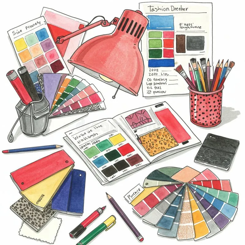
Photo: illustrator color palette swatches on desk with sketchbook warm tones, via thumbs.dreamstime.com
Every commission starts the same way. Contract signed, deposit cleared, brief open in one tab, blank canvas in the other. And then — before a single line is drawn, before composition or character or concept — you pick a color.
That pick is not an accident. According to the illustrators we spoke with, it's closer to a fingerprint. The hues you reach for on day one of a project quietly announce your working mood to anyone fluent enough to read them: your client, your art director, and especially the fellow artist who scrolls past your process posts and thinks, oh, they're in a mustard phase again.
The Theory of the First Swatch
Brooklyn-based editorial illustrator Dana Okafor puts it bluntly. "The first three colors I drop into a file are a diary entry I didn't consent to writing. If I open a brief and reach for dusty teal and burnt orange, I'm calm. If it's neon coral, someone in that brief said something unhinged and I'm processing it chromatically."
Okafor isn't alone. A loose pattern emerged across our conversations: illustrators tend to open new commissions with a palette that reflects their emotional read of the project, not the brief's stated mood. A cozy children's book commission opened with icy grays? That illustrator is fine, thanks for asking. A corporate annual report opened with sunshine yellow and bubblegum pink? Someone's coping.
"Clients never say it out loud," says Portland illustrator and character designer Marcus Tran, "but they feel it. I've had art directors reply to my first color pass with 'love the energy!' when what they're really responding to is that I subconsciously painted their fintech startup like a warm hug. They're not reacting to the design. They're reacting to my mood wearing their brand as a costume."
The Palette Drift: Sketch to Sign-Off
Here's where it gets interesting. The opening palette almost never survives to final approval — and the way it changes tells its own story.
Most illustrators describe a recognizable arc. The first-pass palette is instinctual and slightly indulgent: the colors you like. By round two, client feedback starts sanding off the personal edges. By final approval, the palette has often drifted toward something safer, cleaner, more legible — what Tran calls "the beige-ing of the vision."
But not always. Sometimes the drift runs the other direction. "I had a pharma client last year," Okafor recalls, "where my first pass was very restrained, very professional blue. By round three they'd pushed me so far into joyful chaos that the final art had confetti colors in it. I opened the project cautious and they talked me into a party. The palette drift can be a compliment."
The gap between swatch one and swatch final is, in a sense, the truest portrait of the collaboration — a two-color timeline of who compromised, who pushed, and who quietly won.
Reading Other People's Mail
Fellow artists, naturally, have turned this into a spectator sport. Process posts on Instagram and Bluesky get decoded like tea leaves. A peer opening a book cover with muted sage and cream? "They're in a good place." A sudden pivot to high-saturation magenta mid-project? "Check on them. Or check on their client. Possibly both."
There's a professional utility here too. Art directors who follow illustrators long enough learn their default registers — and can tell when a portfolio piece was made on a good day versus a survivable one. Some illustrators even weaponize it. "If I want a moody editorial gig, I post process work in my gloomiest palette for two weeks beforehand," Tran admits. "It's method casting. It's not lying. It's curating my weather."
The Self-Quiz: What's Your Opening Swatch?
Curious what your first colors are confessing? Answer honestly.
1. A new brief lands in your inbox. The first color you open is:
- (a) A warm neutral — cream, oat, soft terracotta
- (b) Something saturated enough to wake the neighbors
- (c) Whatever's already on your recent-swatch bar, no judgment
- (d) A moody blue-gray you'd describe as "sophisticated" and your friends would describe as "sad"
2. Mid-project, your palette gets darker. This means:
- (a) The brief called for drama and you're delivering
- (b) Revision round three happened
- (c) It's November and you live somewhere with actual seasons
3. A client says your first color pass feels 'off.' You:
- (a) Adjust gracefully — it's their brand, not your therapy session
- (b) Defend the swatch with a 40-slide deck on color psychology
- (c) Quietly grieve, then adjust gracefully
Scoring: Mostly (a)s: You are emotionally regulated and your palette knows it. Mostly (b)s: Your colors are a group chat and everyone's typing. Mostly (c)s: Your recent-swatch bar is a museum of your last six moods, and honestly, that's art too.
Own Your Signature
The takeaway isn't that you should sanitize your instincts — it's that you should know them. Your opening palette is a professional signature, as distinctive as your line weight or your habit of drawing one shoe bigger than the other. Clients hire the whole illustrator, mood included.
So the next time you open a fresh file and your hand drifts toward that particular green, pause. Take a breath. Ask yourself what the color knows that you haven't admitted yet.
Then paint anyway. The diary entry is already happening. You might as well make it beautiful.